MuseumHouse: The Finest House on Bloor
By on Nov 23, 2010
 By Karen Bliss,
Construction is underway on the 13th floor and only now has Elise Kalles of Harvey Kalles Real Estate been brought in to sell the penthouse ready for possession in the fall of 2011, but who that person will be is anyone’s guess.
“The marketing people have indicated that the buyer could be somebody from out of town; it could be a local; it could be an empty nester; it could be a younger buyer as well. It’s not a typical situation,” says Sol Wassermuhl, the principal architect at Page + Steele / IBI Group Architects, (which designed MuseumHouse,) and who has purchased a suite himself.
“So given that we didn’t know who the buyer was, we thought there’s a range of solutions that would be required, so we came up with this idea that perhaps we could invite three top-notch interior designers to come up with their vision for this incredible penthouse.”
The designers — Fenwick Bonnell of Toronto’s Powell & Bonnell, Patty Xenos of Montreal’s Patty Xenos Design and Alessandro Munge of Toronto’s Munge Leung — all had the same canvas with which to work and the 5,618 square foot penthouse floor plan can accommodate all three floor plans.
“We took a bit of a risk because we did not give them indications of direction,” Wassermuhl told NewInHomes.com “We left them to do their own thing. We were very much delighted as each showed a different direction. One is very modern, and almost minimalist; one is traditional; and one is transitional. And that’s the way it has worked out.
“Powell & Bonnell took a more traditional approach for empty nester, your more traditional buyer in Toronto. Then Alessandro took a very creative, more modern and interesting approach. He opened up the space completely. And Patty, who just came off the Ritz Carlton Hotel and Residency in Montreal, has a bit of a hospitality look to it and a more transitional approach, as I call it. We were thrilled that they are so diverse.”
 The condominium, named MuseumHouse because of its locale — across from the Royal Ontario Museum, Daniel Libeskind Crystal, Gardiner Museum of Ceramic Art, Queen’s Park and the Ontario Legislature Building, and just north of the University of Toronto’s St. George Campus and Philosopher’s Walk — is surrounded by history and the splendor of Toronto.
This excellent address is within walking distance are the luxury shops and restaurants of Yorkville and Hazelton Lanes and the designer shops and mass merchant chains on Bloor Street West, as well as the Bata Shoe Museum, Four Seasons Centre for the Performing Arts, and assorted Annex-area nightlife, shops and eateries.
Developed by Yorkville Corporation, MuseumHouse is clad in limestone, metal and glass, and features 26 full and half-floor residences, each with grand terraces, private elevators and panoramic views of Toronto. Prices range from $2.1 million to $6.8 million (excluding the penthouse) for up to 6,700 sq. ft. and can be customized in either a contemporary or tradition style. The elevator opens directly into each suite. The main rooms have 10 to 11-foot ceilings; the kitchens are equipped with top of the line appliances; the master ensuite spas have heated floors; and there are either one or two state-of-the-art gas fireplaces.
The two-storey 5,618 sq. ft. penthouse that crowns the building features four terraces, two facing north and two faces south, for a total of 1,152 sq. ft. of outdoor space with panoramic views of the city over historically protected property. The interior main floor ceilings are 12 feet high. The buyer will select the interior layout and design from one of the three proposed options, making changes if desired.
“One of the things we have done is overlaid all three schemes with our original template and we are going to allow the construction to proceed on the basis that will allow all these schemes — perhaps not 100 percent; perhaps 98 percent,” Wassermuhl told a room full of journalists at the design presentations. “But we can achieve virtually everything that is proposed in all three schemes. We were very much worried about that.”
Typically, only one interior designer is associated with a building and, in this case, it was Powell & Bonnell, co-founded by David Powell and Fenwick Bonnell. In his presentation for the penthouse, Bonnell had a mix of storyboards and renderings, which included pictures of rooms with the kind of furnishings, possessions and looks that they envisioned for this buyer.
“We weren’t thinking of a specific client,” says Bonnell. “We were thinking of someone who had a certain kind of attitude or an idea about how they wanted to live in the space. So although we did re-plan the space, we thought about the styling. We didn’t think of every single room in the place and worked out a concept.
“We felt that it needed to be something that maybe the purchaser would look at and identify with and see themselves in it, and say, ‘Yeah, this is the essence of how I think I would like to live. That was our basic approach.”
Although he didn’t have a person in mind, Bonnell was inspired by a former client, a 93-year-old gentleman (and former CEO of the ROM) who owned a Bloor Street penthouse. “It was his personal triumph. He knew every piece of furniture. It was all personal to him; it was all important,” he recalls.
“The thing we had trouble with at the beginning is there is no client so that’s a big issue when you’re dealing with interior space,” Bonnell explains. “We have a very personal service in the way that we deal with our clients; it’s more like a dialogue; it’s not a presentation to a client and they buy it; it’s more a discussion about how they want to live. So it’s difficult because weren’t getting any feedback. There was nothing offered other than space.
“If you’re gong to live in a space like this,” he surmised, “and you’re going to spend this kind of money for a space like this, that is how you should live here. Someone who is going to spend $12.8 million they’re going to be able to do that and we want to be able to honour that space by having someone like our client [the 93-year-old] who could really make it so incredible, and so incredibly personal, that it would transcend any trendy idea. So we were really looking at that kind of substance and that kind of quality in the finishing of this space.”
The press materials for MuseumHouse describes Powell & Bonnell approach. They felt “showcasing these accumulated riches [furnishings, artwork, personal items] required maximizing wall space without sacrificing the light airy quality of this glass home. The stairs were moved and housed behind a two-storey wall, establishing a feature space for a key piece of their collection. Upstairs the doors were moved to the ends of the corridor leaving walls free to create a gallery space. In both the conservatory and master bedroom, the terrace doors were expanded, allowing the outside to become one with the interior and ensuring that the sights and sounds of the city can be fully consumed when desired.
 “A quiet palette of gesso white and other neutral tones allow the artifacts to speak for themselves. The sumptuous fabrics create a balance between the tactile and visual experience of each room. The handcrafted pieces and the finishings are carefully orchestrated to create a dialogue between the past and present, suggesting a layering of time. The result is space where every room houses a collection that widens eyes and inspires, which is, in fact, the essence of any collection that is worthy of being housed in glass.”
All the drawings in Bonnell’s presentation Powell had done by hand in order to maintain an “essence of being art or the art of living.” Bonnell feels their design is “somewhat transitional. It’s not wholly traditional or contemporary.”
Patty Xenos also opened her presentation by reiterating that not only was there no client, but no budget. She says she discussed with her office staff how to approach this and decided on drawing on their experience with other luxury residences and taking a look at the location and surrounding architecture — classical as well as modern.
“We took a look at making it as appealing as possible and to as wide a market as possible and then looked very closely at the floor plan to see what are the assets, the charm [that] the space can give us. And the number one thing that jumped out right away is the amount of light this building at that level will be benefitting from,” she says.
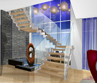
The press materials describe how she would design the space: “Upon arrival, the warm foyer exposes a grand light-frame staircase to the upper level, which allows a flood of light and provides drama without exposing all of the residence at once. If friends and family are being entertained in the living room or a confidential meeting is being held in the office/den, VIP guests would not be aware of staff and other residents coming and going at the elevator foyer. The staircase does expose the two-storey water wall in the heart of the suite, which links the sleeping quarters to the entertainment areas and diffuses sounds to provide tranquility.
“The multifunctional office/den can be left wide open to expose the spectacular southeast and southwest corners, or it can be closed off with mobile partitions. Similarly, the dining room is designed so that a semi-private dinner can be enjoyed, and intimacy to the sleeping quarters above is provided by sidewalls. Wood paneling with fine book-matched veneers surround the dining area and office/den to create a luxurious environment.
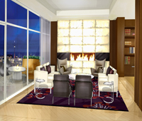
“The transparent wine cellar provides a rich backdrop for the dinner table and a divider to the family room/informal dining and kitchen. This way, any catered event can unfold without introducing aromas and noise into the entertainment area. An oversized, softly backlit fireplace compliments the living room. This element is a work of art in itself, and will create intimacy, even when there is a group of two.
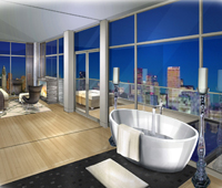
“On the upper level, the master bedroom layers out to take advantage of the full exposure to the southern terrace by simply opening up the ensuite mobile partition. A fabulous oversized pedestal bath sits on the granite floor that runs into the terrace, where it becomes an infinity pool feature. Along with a sauna, this feature provides a soothing spa feel. A slim, low-profile, two-sided stone fireplace is strategically located opposite the bed without blocking the panoramic views, and provides a romantic ambiance and warmth on a chilly evening on the terrace.”
“It’s obviously lots of fun to do projects like this,” says Xenos who worked the fire and water theme throughout the space. “You can let yourself go and imagine.”
The last of the presenters, Alessandro Munge, also didn’t have a buyer in mind, at least not demographically, more psychographically.
“Much like everyone else, we just went with what felt right,” he told reporters. “Who that client is ideally in our mind is somebody who has an ability to live in this kind of lifestyle and I think maybe someone who is a collector. Is this person a certain age? We don’t know.”
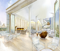
Munge says he envisioned a person with a great art collection. Applying his philosophy to a space, he approaches it as a “journey,” where people can take one step after another and enjoy the “visual stimuli” whether it be specific piece or the connection of the exterior and interior. The place becomes a work of art itself from the physical layout to the choice of classic materials to the “very clean” furnishings (“furniture should be classic like art,” he says, “and not just pieces to put your bum on”). The focus piece is the staircase, a sculptural ribbon that is as eye-catching as it is functional.
 “The highlight of the sophisticated design is the dramatic winding staircase to the second floor,” states the press materials. “Crafted from concrete and covered with white plaster, this massive architectural element has a sculptural, clean look, and is in itself an art form between the living and dining rooms. Upon exiting the elevator, the first view is to the south through the expansive windows, and the gaze to the east includes the remarkable textured stairway. When descending the stairs from the second level, views of the city can once again be appreciated – a rare occurrence on the ground floors of two-storey homes in Toronto.”
The press description also explains his approach: “With the penthouse offering north, south and east views through massive window walls on the main floor, as well as vistas to the west from the terraces, we decided that a more modern, open-concept interior space would maximize this major benefit. Through the use of clean, simple palates featuring timeless, classic materials, the layout offers a magnificent contemporary showcase for artwork. The main floor is equally as conducive to entertaining on a grand scale, hosting an intimate dinner party, or spending a quiet, relaxed evening at home.
“Overall, the palette for the penthouse is light in tone. Materials such as rich pale-on-pale woods with cutouts, Italian limestone, Venetian plaster, blonde accents, and slick hardware combine with eclectic furnishings gathered from around the world to achieve a European flair.”
Wassermuhl couldn’t be more pleased with the results, fascinated to see how three different designers approached the same space in “such a dramatic different fashion,” he says.
“Also symbolic to me of how different [their] approaches are for all three , it’s interesting to see the original staircase by Fenwick which had picture frame detail and then Patty’s modern staircase and then this organic staircase here. Very different.”
A stairway to architectural and design heaven — and also to home, for someone, somewhere.


