6 designer tips for choosing paint combinations!
By Jo-Ann Capelaci on Sep 02, 2015
What happens when you mix a former art gallery owner with an interior designer? Magic!
When I met Wendy Tracey, Director of Marketing for Mason Homes, I knew instantly we would work well together. The former art gallery owner not only has an eye for art but a talent for interior design and an understanding of space and art form. I am working with Mason Homes at their Parklands site in Peterborough. Four model homes are due to open in the fall of this year. I will be designing two of these models, Wendy the other two.
When I came on board to assist with the project, Wendy had begun to purchase some selections of furniture, art and accessories for the homes. She asked me to look at the items to see what I would like to incorporate into the design. I was thrilled to see some terrific art choices.
Then I spotted an area rug that Wendy purchased, at a steal of a deal I might add, that could easily take the lead of the design. Many times when I am designing a model home (or a custom home) I will develop inspiration for the design direction of the home from a patterned fabric, a colour, a piece of art, or in this case the area rug pictured below.
 Area rug for living room of Linden model
Don’t know where to begin choosing paint colours for your home? Here’s how I chose the paint palette for the Linden model and some tips on how you can choose paint for your home around one key element.
Six tips for choosing paint to bring magic into your home:
- Find the design inspiration for your new home. In my case, it’s the area rug. The paint colours that I selected for this model can be found in the piece.
- Pick a few colours that you like from your inspiration. I chose Benjamin Moore’s Vellum for the living room, dining and kitchen. I wanted a warm, inviting colour to draw you into the space.

- Use a neutral colour in your combinations. You can have too much of a good thing, so I picked a neutral colour to complement this stronger statement. For the stairways, hallways and a few secondary rooms, I chose Benjamin Moore’s Natural Linen. A neutral paint colour is a backdrop for accessories and art work.
- Have some fun by adding a bold paint colour for added drama. I chose Benjamin Moore’s toasted chestnut in the powder room to accomplish this goal.

- Choose softer hues within the same colour family for other rooms in your home. Benjamin Moore’s Honey Harbour was my pick for a softer, lighter colour in the master-bedroom.
- The colours of your home should flow throughout. Colours can be repeated for interest in varying tints, tones and shades.

Look for updates on the opening dates of the model homes and come and see how we pulled this entire look together in the Linden model with just one key element; the area rug! And I am excited for you to see some of the fabulous art pieces in all of the model homes, especially a spectacular piece Wendy found that I am incorporating into the stairway of the model!
Jo-Ann Capelaci is president and principal interior designer of Colours & Concepts. The company specializes in model homes and colour and upgrade selections for builders. They have been helping new home buyers choose finishes for their homes for over 20 years. Jo-Ann is dedicated to helping new home buyers create a model home feeling in their new home. Look for future articles on other topics to assist in decorating and designing your new home.
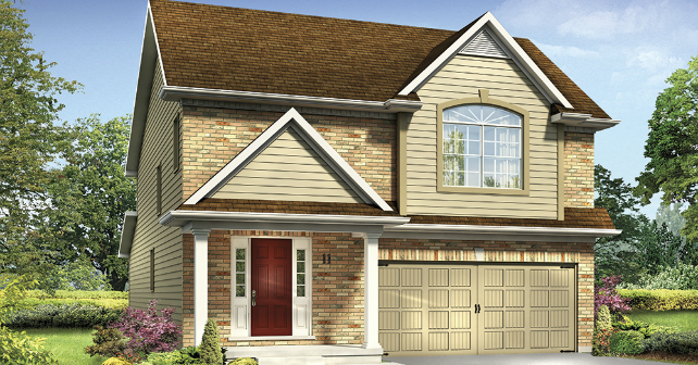
Feature image: Mason Homes - Parklands in Peterborough – The Linden Model


